Thursday, November 8, 2012

ARCH1202// Studio 4// Final Assignment

 
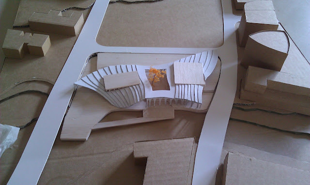
In this final design stage, I took the ideas fained from previouse tutoring session, both Nikolina's suggestions and my own interpretation. Few steps were takend to improve and complete the design than the previous assignment.
 
My main idea can be divided into three major parts, which are gethering, remembering and connecting.
 
First of all, come to the gathering, this site as the intersecting point of the most important axis od Parramatta city. Along Church street , comercial is the main theme of this street, from Westfield shopping centre and passing throough retails and restruants then coming to the site, thus,the theatre can be sonsidered as a transforming functioning result from a commercial centre to a cultral centre.
 
 
As the city of Parramatta has a long history, the historical aspect is another point I gained from the site analysis, thus I studied further on the different facade of the historial buildings including hurchs and townhall, to the laetest Westfild shopping centre. The extrodinary Arches and Colonnade has been takend and applied on the theathre design, that parrallel to the trasforming of fuction, also a transforming of facades.
 
 
The third aspect of my design is the connecting of the earth and the water, thus I mimis the building into the site in order to connect the buildingboth the the streets and the water. The roof is aviliable for public to walk on and two roofs of these two seperate theatres can be use as platforms for outdoor performance.


Final Presentation Poster
 

1:500 Model Top View
 
1:500 Close View of the top roof

1:100 Section model
1:100 Section Close view of the small Theatre

Thursday, September 13, 2012

Final// ARCH1202 Design Studio 4// Project 3 Draft Design Process

In this design process, I took the things I've learnt from both project 1 site analysis and project 2 precedents studies to support my design.

The central concept of my design is radiating, the reason why is the site is located where old meets new and commercial area meets residential rear, also a conflict zone as the North-south axis and East-west axis which are Paramatta River and Church Street separate the city into active zone and inactive zone. Thus I treated the Theater as a new culture center to radiate the power of music and sense of connection to everywhere of this city.

As my tutor Nikolina suggested, the connection between the river and the site , as well as the connection between the public zone on the site and the Prince Alfred Park need further develop. Also, the building itself can also be improved by play up with the gravity , cantilever and materiality to create a floating feeling of this building. These ideas will be put further while developing this design.

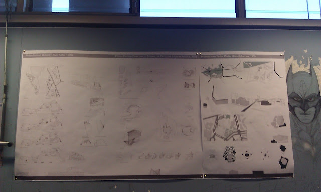
The image below is my poster, and I have images of my model coming up soon.

And the disconnecting on the master plan was caused drawing on separate paper and the rendering dosen't match, I fixed this problem on the presenting poster.


Thursday, August 23, 2012

Weekly Process W5// ARCH1202 Studio 4// Project 2// Precedents study


Within week 5, I analysed roughly on site which shows the relationship between the building itself and the open spaces in a closer boundry. At the same time, I been looking through the auditorium by analyze the seating area and teh circulation inside the auditorium. 


Weekly progress Analysis poster

Final// ARCH1202 Studio 4// Project 2// Precedent Study

In this Project, the three precedents been choose by our group is Phillips Pavilion by Le Corbusier, Finlandia Hall by Alva Aalto and Philharmonie Berlin by Hans Scharoun. My major concern was on Philharmonie Berlin and partly Phillips Pavilion.

During the process of precedent study on Philharmonie Berlin, As this building's resource was not as much as other world-wide famous buildings, I start ti interpret it by analyzing the surrounding site .

This building was located at the southern boundry of Tiegarten far away from the city centre, which is a suburb placed on the western side of Berlin wall after WW2, The site was surrounded by natural elements which are river and forest on the horizontal line and artificial elements that are highway and Berlin wall on the vertical line. The site it self was developed from a dead zone after ww2 to a highly density of commercial and residential area.The initial idea of German government to introduce the philharmonie into this area is to create a new culture center combine with 20th-century Gallery done by Mies and Scharoun himself's National Library.I sort of compared these two building together to stand out Scharoun's Organism in comparison to Mie's Purity and Less is more.

As for Scharoun, his interpretation of this Project was highly concentrate on the idea of "Music is the center". He was one of those architects who advocate "organism architecture' and this reflected on the shape of this building perfectly, tent look shape and the massive random stairways on the bottom part..

Refer back to the idea ' music is the centre', Scharoun placed the stage in the middle of the Auditorium which  is very unusual and new style. Scharoun give this idea a explanation as 'while musicians performance on the stage , they can transfer the music and passion trough natrue process'. Reviewers also give this idea  praise as the audience will not just concentrate on the concert but at the same time the have the chance to see the facial expression of the other audience which will enrich the performance.
precedents study of Phllips Pavilion


Precedents Study of Finlandia Hall

 Precedents Study of Philharmonie Berlin


 Bigger range site including the surrounding context which are river, highway, forest and Berlin Wall in 3d

Midiuem range site highlighted buildings done by scharoun, Mies, Jan and Piano.

Samll range site showing the relationship of the building with the open spaces 


Illustration showing the comparison study of Scharoun and Mies in elevation with the Berlin wall as background
Comparison study in 3d 

  Comparison study and site study in 3d city view

Figure showing columns to indicate the column if the space, as more columns=structure means a bigger room

figure showing stairs only indicate the massive and confusing circulation on the entrance level


study of the building regarding to private and public area, black colored shape is private area which includes musicians' prepare and practive room , also servant area such as boiler room

figure showing seating area and stage in the middle

figure showing the influence with the audience seating sorrounded by the stage
 3d figure study of the seating placement, even seat at the back of the stage, although the sudience will lost the chance to see the face of musicians, but they will have an extrodinary chance to see th econductor's facial expression

Our presentation


Thursday, August 9, 2012

Weekly Progress W3// ARCH1202 Design Studio 4// Project Parramatta Analysis

After the site visit I ahve come out with a series analysis on majorly four aspects which are peredstrian space, solid and void space and  activity space.


The draft model

Weekly Process W1// Arch 1202 Design Studio 4// Project Parramatta Analysis

Before uni start, we were asked to choose a theatre and have a site view by analysing a range of perspects.

The site I've choose is the Sydney Theatre at Walsh Bay done by PTW firm.


Final// Arch1202 Design Studio 4// Project 1// Project Parramatta Analysis

The first project was composed by majorly two parts which are site anaalysis of Parramatta city and the stage design based on the movie West Side story and refer back to the conceptial ideas took out from Parramatta city analysis.

In the analysis stage we did research on Parramatta by reading the council documentaries and teh book Visulazation Power. The approaching of this analysis is set out by urbanization, historical, topographical and environmental aspects.


Group poster @A1


On the Concerntina book, I try to illustrate the city both from a top view of the whole city, the George Street are and the Town hall piazzar scale down gradually. Meanwhile I did a series perspective sketches along George street as this street was emphasized as the cultral expand grid in Parramatta with historial meanings. Moreove, I looked at the perdestrian lane in the density urban area as though these lanes exist but citizens seldomly use it.
 The top view of the large city area
 Site location in a relationship within the whole Sydney area and figure ground
 Top view of George Street area
 Top view of Town Hall piazzar and perspective sketches of the Town hall building and St. John church
 Figure grounds of the city area and lanes
 perspectives on George Street from Westfield to St.Peter Church
 Perspective along George Street from the bridge to Prince Alfred Park
 Perspective of Philip street and long River Bank


 Move to the stage design part, we treated Parramatta as a site includes basicly three elements which are water, bridge and religion. Thus we come out the idea of the garden like design. We also did some case studies on Carlo Scarpa's works as his stairs were amazingly communicate well with the open spaces.


 Stage plan and elevations